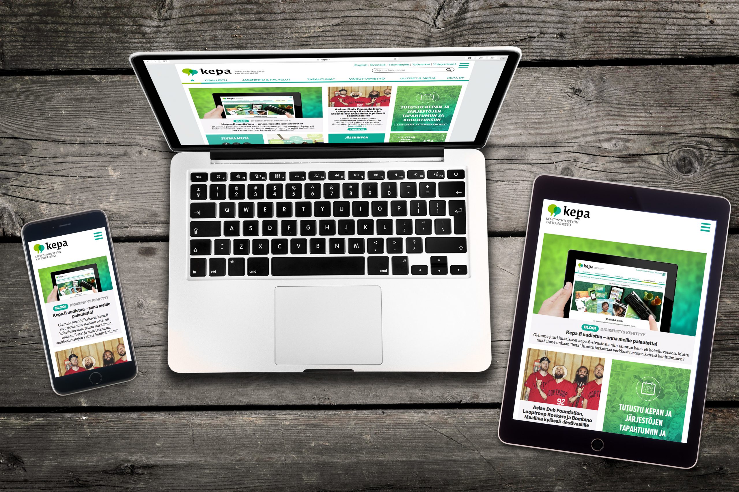
Our most important communication channel, kepa.fi, was a bit of a hot mess for quite some time: there was a ton of important information that couldn’t be easily found from our complex site structure and the Drupal community had ended its support for the outdated version that we had been using on the site. Our mobile user experience was also abysmal despite the fact that the proportional number of mobile users on our site was increasing steadily.
Our old site definitely caused mild anxiety to many of our teams, but the situation was pretty much a jackpot for a digital project manager: you could basically re-create the entire site from scratch.
We started the redesign process by putting the user front and center in all our planning. We wanted to know our users better and solve their challenges before they even get to them. We conducted a lot of extensive user research in the form of surveys, focus group interviews and usability and card tests. Kepa’s staff also requested that the site would be faster and easier for them to use, and we all wanted the results of Kepa’s work and our experts to be featured more prominently on the site.
One thing was also crystal clear: the site’s mobile and tablet user experience has to be downright exquisite.
After the project’s goals and key performance indicators had been established, it was time to put the plans into action. We crafted, fine-tuned, tested and revised our site’s new structure and user interface – and then tested them some more. Our AD created a gorgeous and timeless design for the website that both embodies and strengthens Kepa’s brand. All Kepa teams produced new content and edited old ones. Everyone took an active part in the process and everyone helped out.
The technical production process moved forward rapidly using agile development principles: we progressed in short stages (iterations), built functionalities incrementally and tested everything meticulously. Our cool-headed web developers deserve a special honorary mention, as the site was built upon the then-brand new Drupal 8 which at that point in time was in a semi-unstable beta mode. Yikes.
Obviously not everything went without a hitch and according to our initial plans: the structure of the team changed over the course of the lengthy project and there were a couple of longer-than-usual work days toward the end. The principle of ”early release” was also quite new and possibly a little foreign to many:
Yes, the site is viable but not quite 100% perfect just yet – we’re still going live!
Now, however, one can’t help but smile when admiring our brand new kepa.fi: holy smokes how pretty it is! Pretty obviously isn’t everything – the new site is now also much more functional, easy-to-use and cleared of extra clutter. Our work definitely doesn’t stop here – maybe it just got started? – and there are a lot of new elements, functionalities and even the occasional bug fix that still need our undivided attention.
Despite the number of tasks left on our To-Do-lists, the site has already taken an enormous leap toward the ambitious goals we set when we first started. For example, navigation is now a breeze on all devices:
,
,
One of our most important sections, our news production, is now more visual, the reading experience is better and it’s also easier to share individual news items on social media. Kepa’s own professionals and their expertise are also accentuated much more throughout the site.
,
,
And of course, our crucial member services now function in a more reliable manner across all devices:
,
,
As I already mentioned in my previous blog post about the redesign, this is a terrific start for the continuous development and improvement of kepa.fi!
Do you want to let us know what you think about our new site, or did you possibly spot a bug? Drop us an email!
